Designing the first in-app tax payment experience
Transforming a fragmented government process into a trusted product experience.
Context
In Brazil, more than 14 million entrepreneurs operate as MEIs (Individual Microentrepreneurs), a simplified legal status created for one-person businesses.
To keep their business compliant, every MEI must pay a fixed monthly tax through a government-issued document called DAS.
Although the system was designed to simplify tax payments, the experience remained highly fragmented.
Before paying their taxes, entrepreneurs had to access a government website or a third-party service to generate the DAS, then switch back to their banking app to complete the payment. These government systems were only available on the web and were consistently described in user interviews as confusing, outdated and difficult to navigate.
As a result, many entrepreneurs hired an accountant for a task that often consisted of nothing more than generating the monthly DAS and sending it to the client for payment.
This wasn't just an operational problem. It affected how entrepreneurs perceived running a business.
Our research showed that 48% of users saw taxes as the biggest barrier to growing their business. Taxes were perceived as complex, bureaucratic and purely mandatory, with little or no value for the entrepreneur.
For Nubank, this represented an opportunity to remove one of the most repetitive bureaucratic tasks from our customers' routine while increasing engagement with the Business Account.
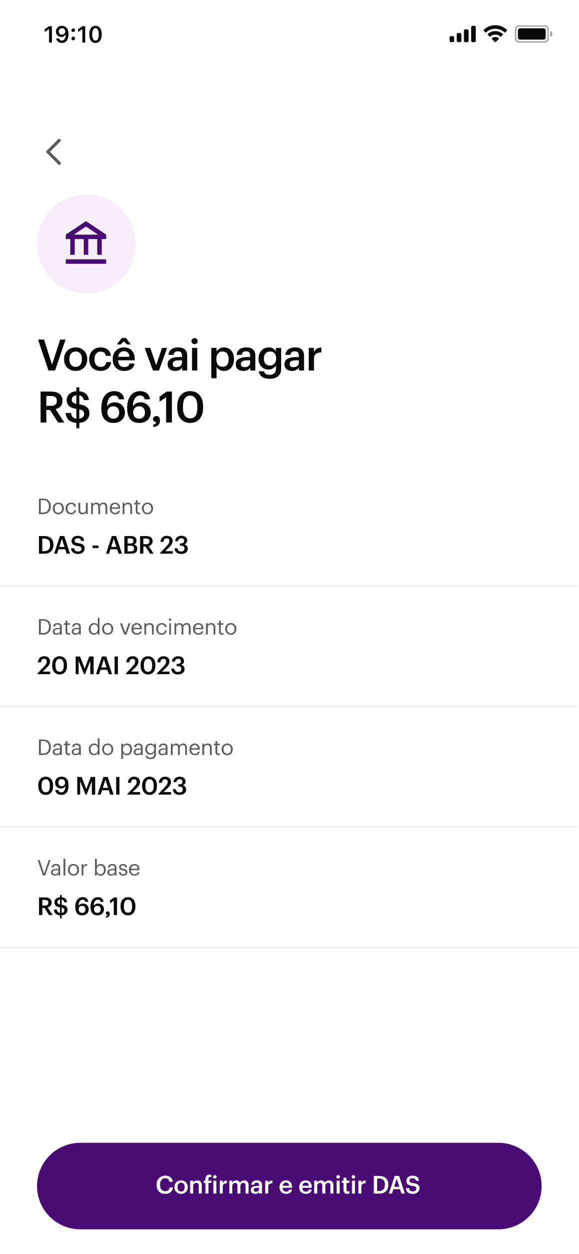
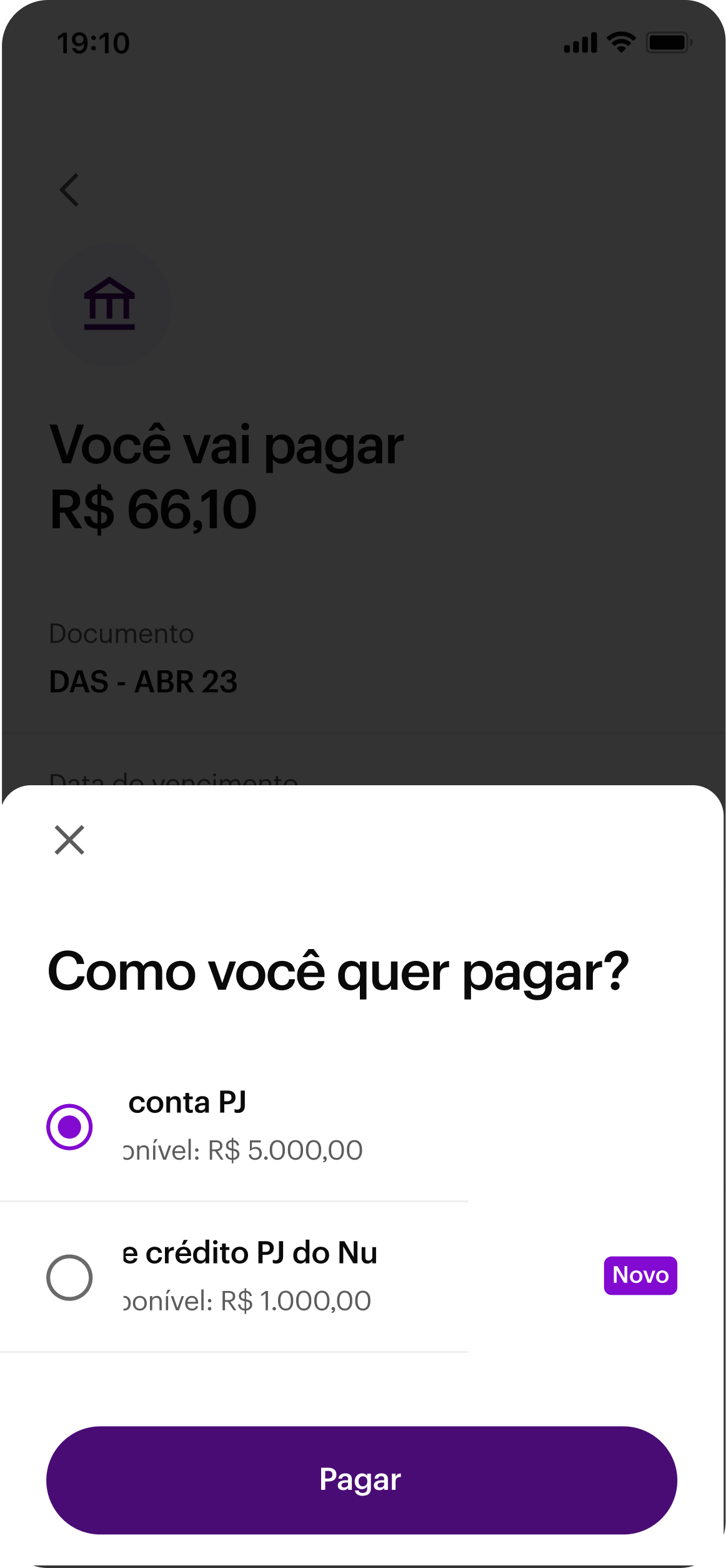
Our hypothesis was simple. If entrepreneurs could generate and pay their DAS directly inside the Nubank app, we could eliminate unnecessary steps, reduce friction and make tax payments simple enough for users to stop relying on external services or even accountants for this recurring task.
There was also a strategic reason to move quickly. We knew other companies were exploring the same opportunity, and becoming the first bank to offer this experience directly in-app aligned with Nubank's mission of fighting complexity to empower people.
The challenge
When I joined the project, the team had already explored the problem space, reviewed customer feedback and created an initial proposal for the experience. My role was expected to focus on refining the solution before development.
Instead, I started by questioning the assumptions behind the existing design. After reviewing the research, the proposed journey and the early design explorations, I realised there was still significant room to simplify the experience before validating it with users.
At that point, I reframed the challenge. We weren't simply building a new payment flow. We were asking entrepreneurs to change a behaviour they had repeated every month for years.
Some relied on government websites. Others used third-party services. Many delegated the entire process to an accountant.
If we wanted users to trust Nubank with such an important responsibility, the experience had to do more than support tax payments. It had to reduce cognitive load, inspire confidence and make tax management feel simple enough for entrepreneurs to handle on their own.
That became the principle behind every design decision that followed.
Simplifying the problem before designing the solution
As I reviewed the existing proposal, one thing immediately stood out. The journey had been designed around scenarios that affected only a small percentage of users. My hypothesis was that we were making the experience more complex for everyone else in order to support edge cases.
Before proposing any changes, I shared this concern with the Product Manager and asked the data team to quantify how representative those scenarios actually were.
The numbers confirmed what we suspected. Edge cases accounted for only a small portion of the user base, giving us enough confidence to optimise the experience for the majority and address those scenarios later if they proved to be relevant.
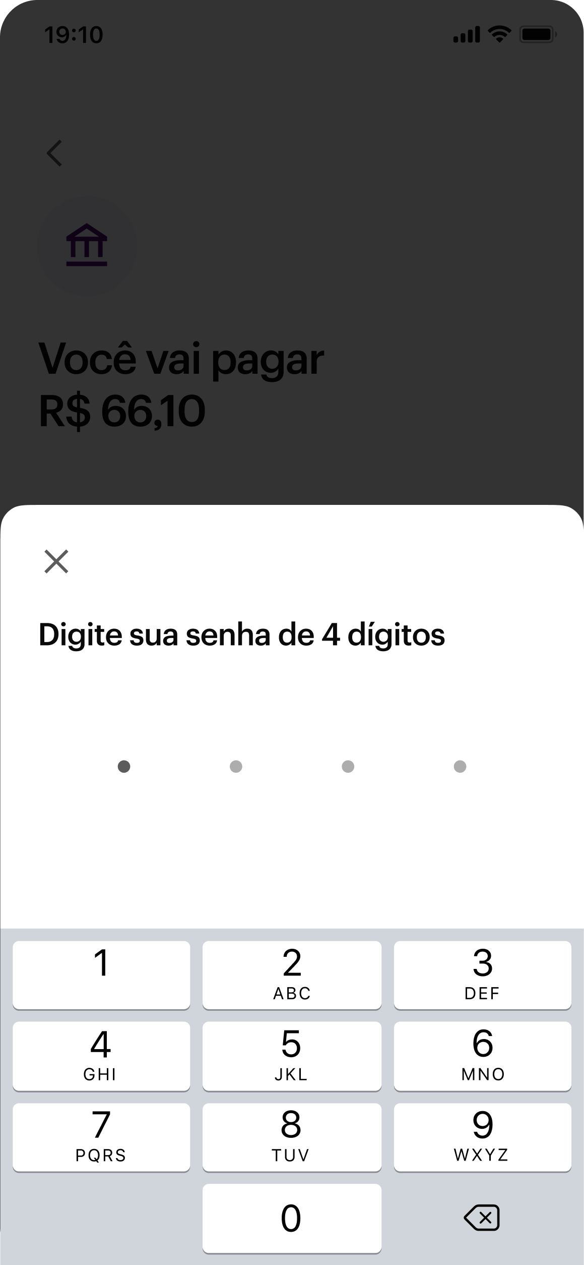
This allowed us to remove unnecessary steps, eliminate information that distracted users from their goal and redesign the journey around a single Job to Be Done: generate and pay the DAS with confidence.
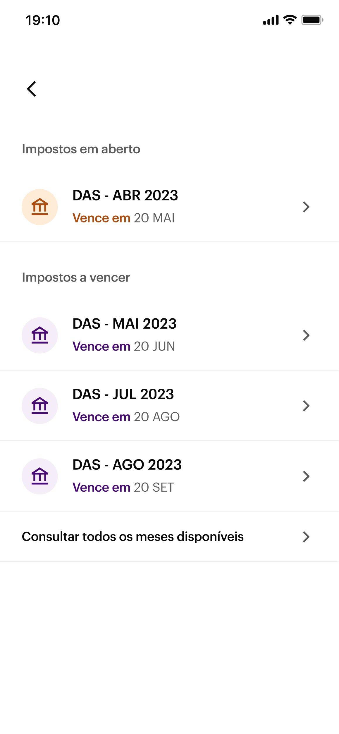
I also revisited how users selected the tax period. Behavioural data showed that approximately 95% of payments were made for one of the three most recent months.
Instead of exposing every available period, we prioritised those three and moved the remaining options to a secondary level of navigation. This reduced visual complexity without preventing users from accessing future tax periods within the same fiscal year.
The interface became simpler because it reflected how people actually behaved.
Before moving into research, I facilitated design critiques to challenge the proposed solution from different perspectives. Once the team aligned on the direction, I presented it to the project's key stakeholders, including the General Manager and the Design Director, who approved moving forward with usability testing.
Validating the reasoning, not just the interface
Our goal wasn't simply to validate whether users could complete the flow. We wanted to understand whether the decisions behind the experience actually reduced effort and increased confidence when completing a recurring tax payment.
I led the usability testing strategy in partnership with the Product Manager and the UX Researcher. I defined the learning objectives, designed the participant tasks and attended every session to observe behavioural patterns, identify opportunities for improvement and validate the assumptions behind the design.
After the sessions, I led the design debrief with the team, consolidating the findings and prioritising the improvements before development.
The results reinforced that we were moving in the right direction. Users completed the journey with fewer questions and greater confidence, validating not only the solution itself, but also the reasoning behind our design decisions.
Designing for trust
Usability testing showed that users could successfully complete the flow. The next challenge was bigger.
We had to convince entrepreneurs to change a behaviour they had repeated every month for years.
Until then, paying taxes meant using a government website, relying on third-party services or simply asking an accountant to handle the process. Those options were far from ideal, but they were familiar.
Another insight emerged from our research. Users didn't think about generating a DAS. They thought about keeping their business compliant.
That shift completely changed how we framed the product. Instead of designing a feature to generate a tax document, we started designing an experience around tax management.
This became the foundation of the Tax Hub.
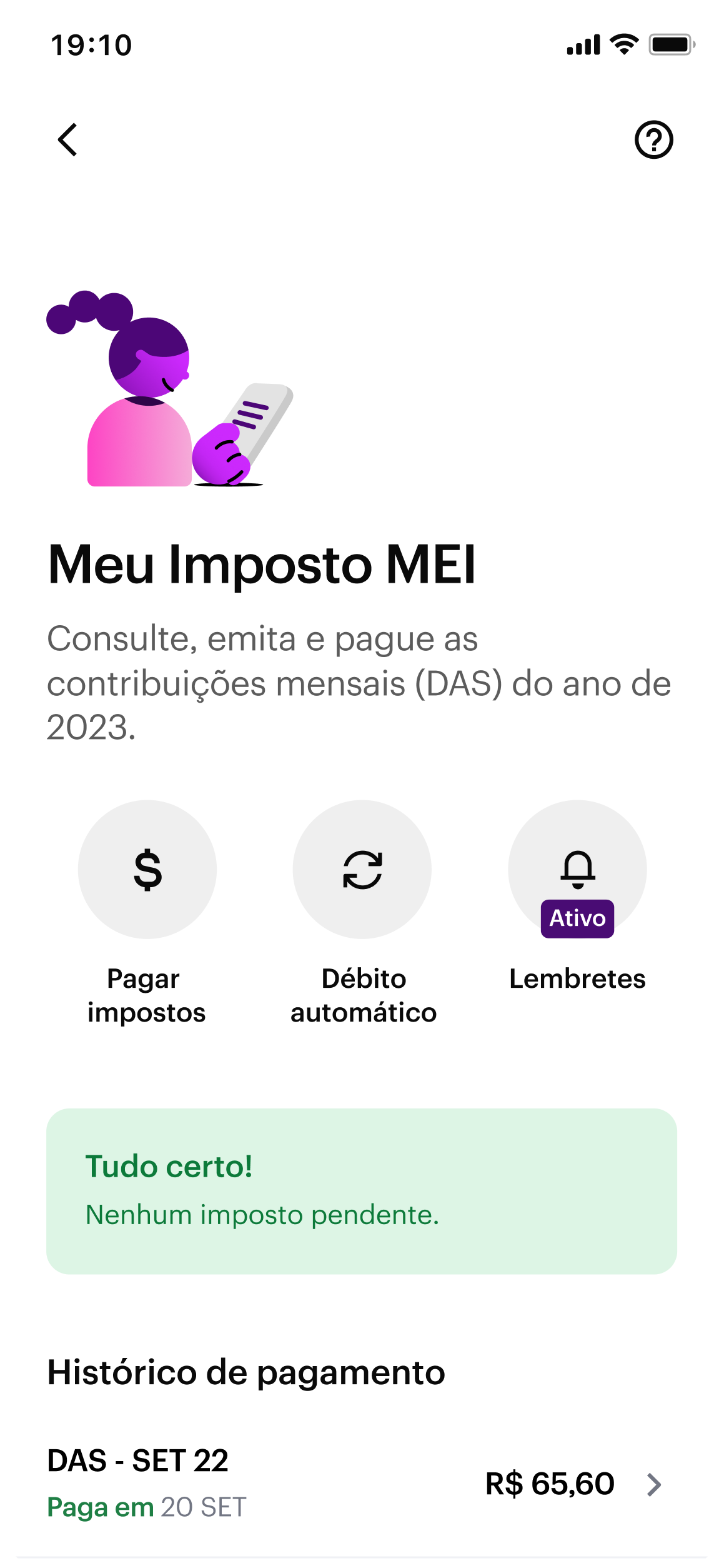
Before the Tax Hub, users had no dedicated place to manage their tax obligations. Once they paid the DAS, the only way to find that information again was by searching through their account statement.
Because we were introducing a new and sensitive behaviour, we believed taxes deserved their own space within the Business Account.
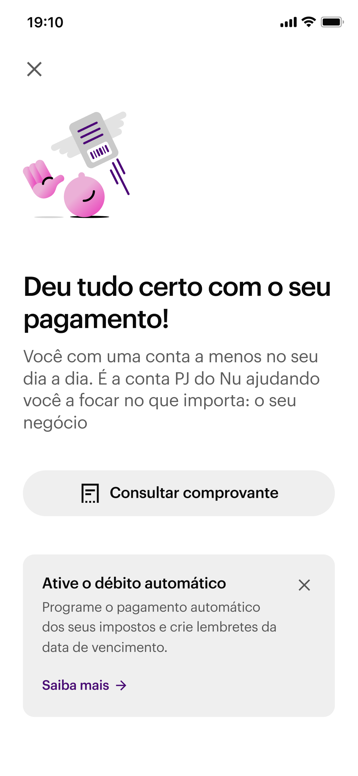
The Tax Hub brought together everything related to this recurring task, including DAS payments, payment status, notifications and direct debit.
One of its most important elements was the status overview.
Before taking any action, users wanted to answer a simple question: "Do I have anything pending?"
The Tax Hub was designed to answer that question immediately. Instead of forcing users to search through transactions or navigate multiple screens, it surfaced the current status of their tax obligations as soon as they entered the experience.
This wasn't just a navigation decision. It was a way to build confidence around a responsibility that could directly impact their business.
Research also revealed two distinct behavioural patterns. Some users preferred receiving monthly reminders and paying manually. Others trusted direct debit and rarely interacted with notifications.
Rather than forcing everyone into the same journey, we designed the Tax Hub to support both behaviours equally, providing dedicated shortcuts for each one.
By organising the experience around how people managed their taxes instead of how the product was structured, we created a foundation that could grow beyond a single feature.
The result was more than a new way to pay the DAS. It became the starting point for Nubank Business' broader tax experience.
Balancing speed with learning
While we were shaping the experience, one key decision remained unresolved.
From the beginning, I believed that selecting the tax period should be done through a list rather than a manual input.
This wasn't a visual preference. It was a cognitive one.
Choosing from a list relies on recognition. Typing a tax period relies on recall. Since the tax period doesn't always match the month when users make the payment, I expected a manual input to introduce unnecessary ambiguity into an otherwise simple task.
At the same time, we had a business objective that couldn't be ignored. We wanted to launch as quickly as possible.
Beyond delivering value to entrepreneurs sooner, we knew other companies were working on similar solutions. Being the first bank to offer in-app DAS generation and payment directly supported Nubank's mission of fighting complexity and gave us a strategic advantage.
To accelerate the launch, we made a conscious trade-off. Instead of shipping the list of open and upcoming tax periods that I had originally designed, we temporarily replaced it with a manual input.
I agreed with that decision because it allowed us to validate the product's value proposition with real users much earlier, even if it meant accepting a less intuitive experience in the first release.
The MVP was rolled out to 5% of our user base.
Within a few days, we identified that nearly 40% of DAS generation attempts resulted in an error.
After analysing user behaviour, we discovered the problem. Many users entered the month when they intended to pay the tax, while the system expected the corresponding tax period.
The behaviour confirmed the hypothesis behind my original proposal. The manual input introduced ambiguity that a list would naturally eliminate.
Because the list had already been designed, we were able to prioritise its implementation immediately. Within a single sprint, we replaced the manual input with the original list and reduced the error rate from 40% to virtually 0%.
More importantly, the MVP achieved exactly what it had been designed to do. It helped us validate the value proposition quickly, replace assumptions with real behavioural evidence and improve the experience without slowing down the product strategy.
Outcomes
Once the experience evolved beyond the MVP, it delivered measurable impact for both users and the business.
- +195% growth in DAS payment volume
- +1.7pp Business Account activity
- 90% three-month retention
- 40% → ~0% DAS generation error rate
According to the Product Marketing Manager, this became one of the fastest products in Nubank's history to reach Product-Market Fit.
What this project reinforced for me
This project strengthened a belief that continues to shape how I approach product design.
The best product decisions rarely start with the interface. They start by reducing uncertainty.
Whenever possible, I try to turn opinions into hypotheses, hypotheses into evidence and evidence into decisions. That mindset guided every major decision in this project.
Question assumptions before designing. Use data to understand where simplicity creates the most value. Validate the reasoning behind a solution, not just whether users can complete the flow.
And when uncertainty remains, make conscious trade-offs that maximise learning without losing sight of the long-term experience you're building.